Exploring the Vibrant and Glamorous Art Deco Colors
Introduction
Art Deco is a style that originated in the 1920s and 1930s and is characterized by bold geometric shapes, streamlined designs, and luxurious materials. The color palette of Art Deco is just as bold and eye-catching as the designs themselves, with rich jewel tones, contrasting shades, and metallic accents. In this article, we will explore the vibrant and glamorous colors of Art Deco and their significance in the design style.
The Colors of Art Deco
Jewel Tones
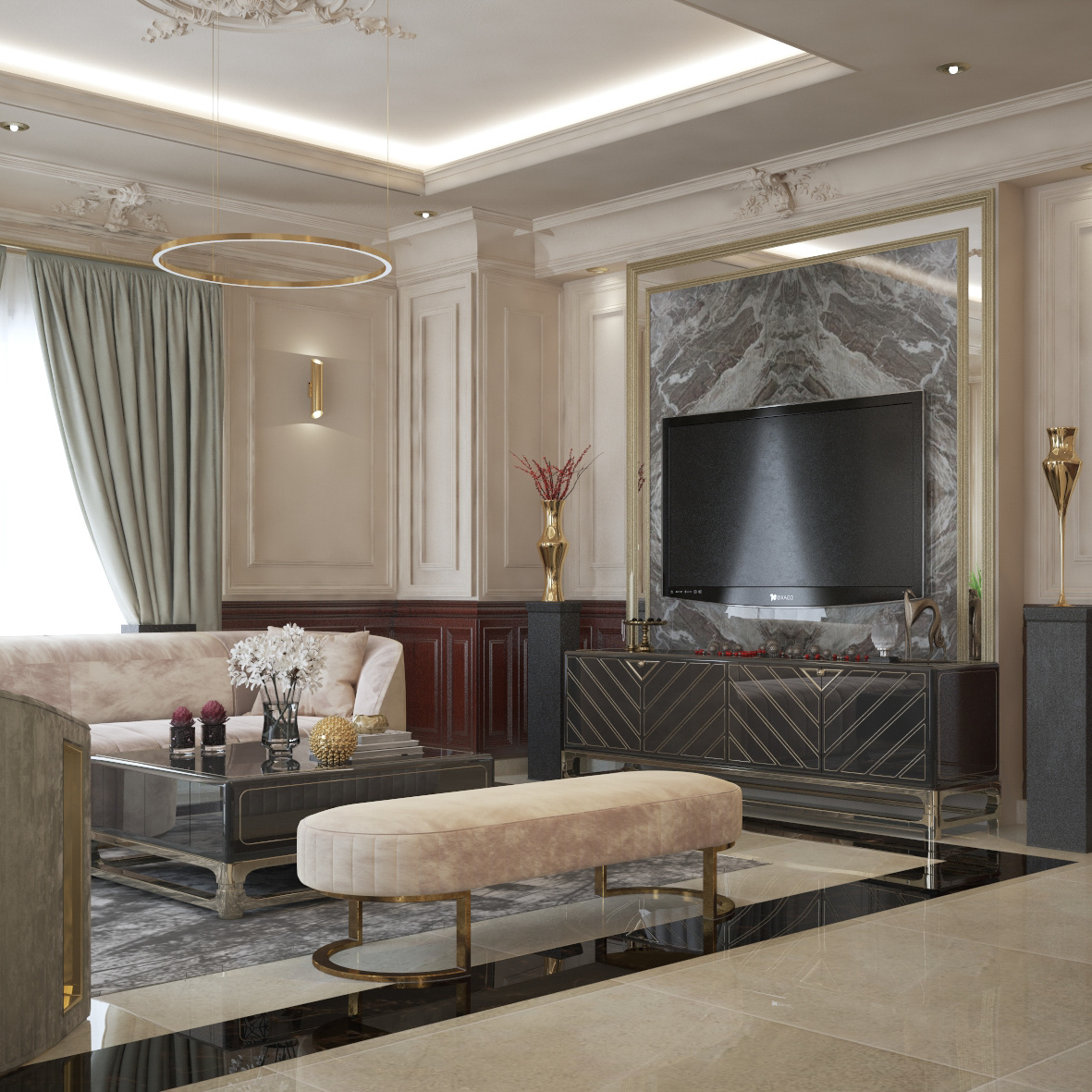
One of the most iconic color schemes in Art Deco is undoubtedly the use of rich jewel tones. These colors include deep blues, emerald greens, ruby reds, and royal purples. These colors were often used in combination, creating striking contrasts that added depth and interest to the designs.
One example of the use of jewel tones in Art Deco is the Chrysler Building in New York City. The lobby of this iconic building features an extravagant mural made up of deep blues, golds, and greens, creating a luxurious and opulent atmosphere.
Metallic Accents
Another hallmark of Art Deco is the use of metallic accents, such as chrome, brass, and gold. These accents added a sense of luxury and sophistication to the designs and were often used in tandem with other bold colors. One example of this is the use of gold and black in the iconic Art Deco poster for the film “Metropolis.”
Contrasting Colors
Contrasting colors were also commonly used in Art Deco designs. For example, black and white were often paired together to create a bold and graphic look. Another bold color combination frequently used in Art Deco was red and black. This combination was used in everything from textiles to furniture, creating a statement-making look that was both bold and glamorous.
The Significance of Art Deco Colors
The use of bold and luxurious colors in Art Deco was significant in several ways. First, it reflected the optimism and opulence of the time period in which the style originated. The 1920s and 1930s were a time of prosperity and celebration, and Art Deco colors reflected this sense of joy and abundance.
Additionally, the use of bold colors in Art Deco was a departure from the more muted and subdued color palettes that had been popular in the past. Art Deco was a rejection of the minimalism and austerity of the early modernist movement, and the use of bold colors was a way of celebrating decorative and ornamental design.


